
In response to the gap between traditional platforms and next-generation investors, I was tasked by Good Finance Securities to redesign the stock trading app’s order page for a more intuitive experience that meets today's investment needs.
Rethink The Way We Invest
Equip investors to invest with confidence through a behavior-driven redesign.

New Investors Struggle with Overwhelming Choices and Guidance for Long-Term Growth
Target User

👤 Demographics
Tech-savvy retail stock investors with 0-3 years of experience.
💪🏻 Motivations
Seek actionable insights and reminders to make better investment decisions for the long-term financial wellbeing
💥 Pain Points
Struggle with information overload, lack of clarity in investment platforms, and fear of missing critical market events.
The Problems They Face with Our Current Interface

Overloaded UI
Too many functions crammed together.
Scattered settings led to investing in the wrong units.
Causes cognitive overload and anxiety.

Investing Without Context
Scattered functions and lack of in-app tools make average cost calculation tedious and time-consuming.
Uncertainty about how decisions affect the portfolio, leading to frustration and reliance on external apps.
Users Need Clarity and Context to Build Confidence
Our researcher conducted 17 interviews to explore user investment behaviors and collaborated with the Investment Department to understand how professional investors invest.
Studies show that new investors often face "choice overload," with 34% feeling overwhelmed by options, 25% delaying decisions out of fear, and many struggling with complex financial products, hindering their investment journey.
Methodology:
🥊
Competitor Analysis
Reviewed the order pages of 21 stock trading apps to identify best practices and gaps.
👀
Contextual Inquiry
Conducted 17 user interviews to understand investment behaviors and challenges.
Cognitive Overload and Lack of Context Hurt Investor Decisions
Through the interviews with the UX Researcher & Investment Analysts and identified these insights:
1.
Overload Inhibits Confidence and Mental Clarity
Investors lose confidence and feel anxious when faced with overly complex UIs. Simplifying navigation is crucial for reducing cognitive overload and enabling better decision-making.
2.
Context Drives Trust and Better Investment Decisions
Lack of context-based tools leads to uncertainty, causing investors to rely on external apps for decision-making. Providing relevant context helps investor make better decisions.
UI Strategies Vary by Investment Style
I reviewed other stock order pages to understand the flow and information and found that short-term traders rely on technical analysis, while long-term investors focus on fundamentals.

Creating a Calm, Contextual Experience for Long-Term Investors
How might we create a calmer, more intuitive investing experience for young, long-term retail investors to ensure they are well-informed and confident before making investment decisions?


What Are the Principles?
After research and analysis, I developed a guiding principle for my design: to be clean for effortless navigation, informative for informed decisions, and accident-proof to minimize errors and ensure a safer user experience.

Restructure The Architecture and Flow
The previous information architecture was fragmented, with circular navigation and scattered features. I restructured it by grouping related functions into clear categories, streamlining navigation and improving usability.

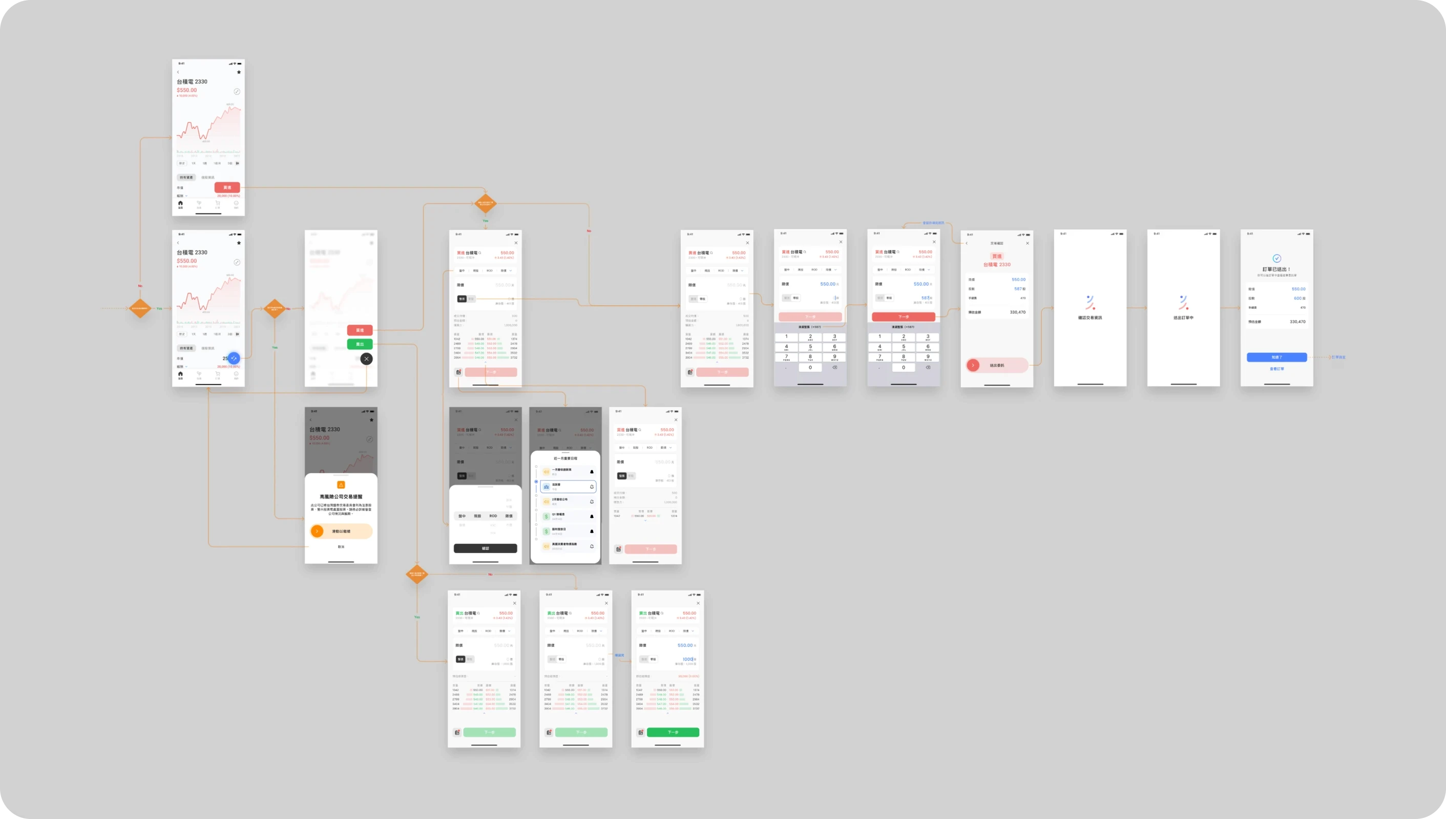
Designing a Calm and Behavior-Driven Order Page
Final Design
Creating a Calm and Streamlined Investing Experience
The order page was designed to create a calm investing experience by focusing on the most utilized features, with advanced settings rarely altered grouped together for simplicity.

Here's the Process
Identify Problem
Understanding the Importance of Each Element in an Overloaded Interface
I streamlined the overloaded interface by prioritizing essential information, collapsing unnecessary elements, and simplifying the layout. As a critical step in the investment journey, the order page needed to reduce cognitive overload and anxiety, helping users feel calm and confident in their decisions.

Iteration
Discovering an Interface That Aligns with Investor Behavior
Working within SDK restrictions and guided by design principles, experimentation involved UI hierarchy, grouping, and elements like colors, interactions, and typography.


💭 I tried changing toggles to multiple drop-downs or experimenting with toggles and drop-downs based on settings types
🙅🏻♂️ But it took too much effort just to change the settings, which didn’t make the experience better.

💭 I tried placing the unit at the top and grouping the buy/sell button with order criteria,
🙅🏻♂️ But this caused excessive finger movement across the screen, especially since users frequently adjust unit settings and rarely touch other order criteria.
Dissecting
Simplifying and Keeping the Essential
I began by identifying excessive elements, then removed or repositioned them, regrouped functions that were more relevant and intuitive, and redesigned the color, spacing, and typography for a cleaner interface.
Designing Features That Allow Investors to Invest With Context
Identify Problem
Investors Rely on Gut Feeling, Leading to Impulsive Decisions

Investors often make decisions without fully understanding their portfolio impact, leading to emotional investing that may not align with their goals.
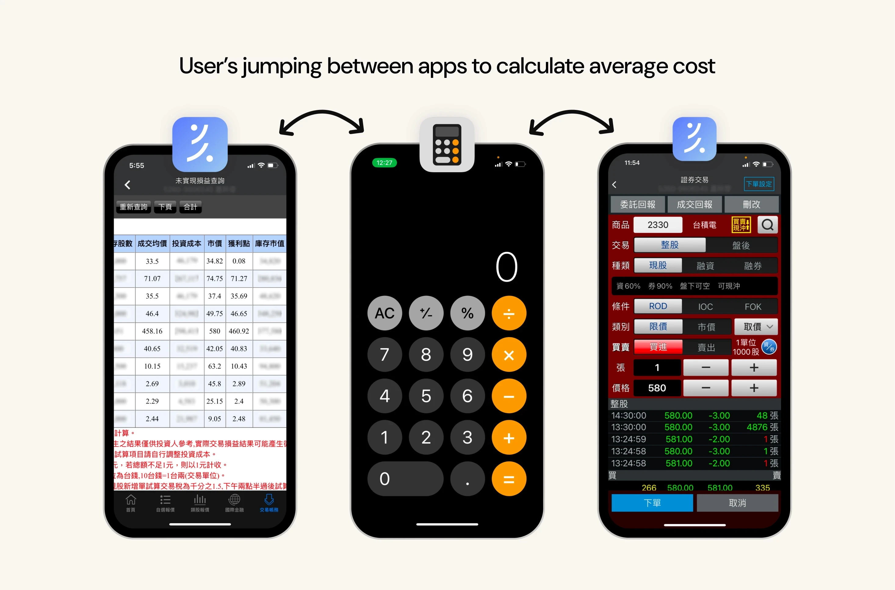
User Behavior
Long-Term Investors Calculate Average Cost Before Investing
Long-term investors calculate average cost to manage risk, but the current interface lacks tools for cost projection, order estimation, and bank balance visibility, forcing users to switch between apps.
This was an opportunity to streamline the experience by automating projections and providing key information for smarter decisions.
Final Design
Calculates Investment Impact Based on User Input, for Clear Future Insights
This feature calculates the potential impact of an investment action based on user input, automatically displaying the average stock cost.
This streamlines the process from "Action" (setting price and amount) to "Projection" (seeing the effect on the portfolio) to "Reaction" (sending the order), eliminating the need to switch between the asset page, calculator app, and order page.

Example: If the current average cost is 500, and the user buys 100 stocks at a price of 550, the average cost updates to 525, giving a clear view of the portfolio impact before confirming the order.
I…Was Wrong!
participants wanted the "+" and "-" icons back
Initially, I considered removing the "+" and "-" icons to simplify the UI, assuming users preferred direct typing. However, testing revealed that 80% of users favored these icons for easier adjustments and reduced typing errors, leading to impactful design improvements.

Building Foundations for Future Designs and Strategic Vision
User feedback emphasized a more intuitive and seamless experience, providing insights that shaped future projects.
Key outcomes included:
Conducted research on stages like "Discover Stock," "Understand Company" and "Add to Watchlist".
Established 3 design principles for each stage of the investment journey.
Collaborated with UX Researchers to test and refine concepts.


Lessons from Observing Users
Behavior Speaks Louder Than Words
Investigating user behavior reveals the ‘why’ behind actions, ensuring our solutions are relevant and user-centric.
Always Look at the Holistic Journey
Consider the entire user journey, not just one part of it. This holistic approach helps design a more intuitive flows that support users at every stage.
Embrace Adaptability in Design
Embracing constant feedback, iterating various designs, and staying updated on trends are key to improving user experience (like Ditto, the shapeshifting Pokémon)
Next Project
Good Finance Design System 1.0
Increase handover efficiency by 20% through the development of a unified system from scratch
The growing product team transitioned from Sketch to Figma to enhance collaboration. However, the lack of a centralized design foundation led to communication issues. Establishing a unified design system simplified workflows and improved collaboration with developers.
