The growing product team transitioned from Sketch to Figma to enhance collaboration. However, the lack of a centralized design foundation led to communication issues. Establishing a unified design system simplified workflows and improved collaboration with developers.
Good Finance Design System 1.0
Increase handover efficiency by 20% through the development of a unified system from scratch.

"Unsystematized Documents Cause Inefficient Workflows for the Team"
I talked to UX/UI designers, Product Managers, and developers, to identify critical issues stemming from the lack of a design system that affect our internal workflow processes and external user experiences:

Different Ways of Making Components
Different designers had varying methods for building the same component based on previous practices, which slowed down the design process.
Disorganized Filing System
The lack of a comprehensive component library and scattered documentation slowed workflows and caused misunderstandings among team members.

Same Components, Different Behavior
Quality tests later revealed inconsistent component behaviors, highlighting a misalignment between developers and designers that led to varied user experiences on iOS and Android.

Various Formats of Writing
A major issue in our app is the inconsistency in writing formats, causing content writers and product designers to use varying styles.
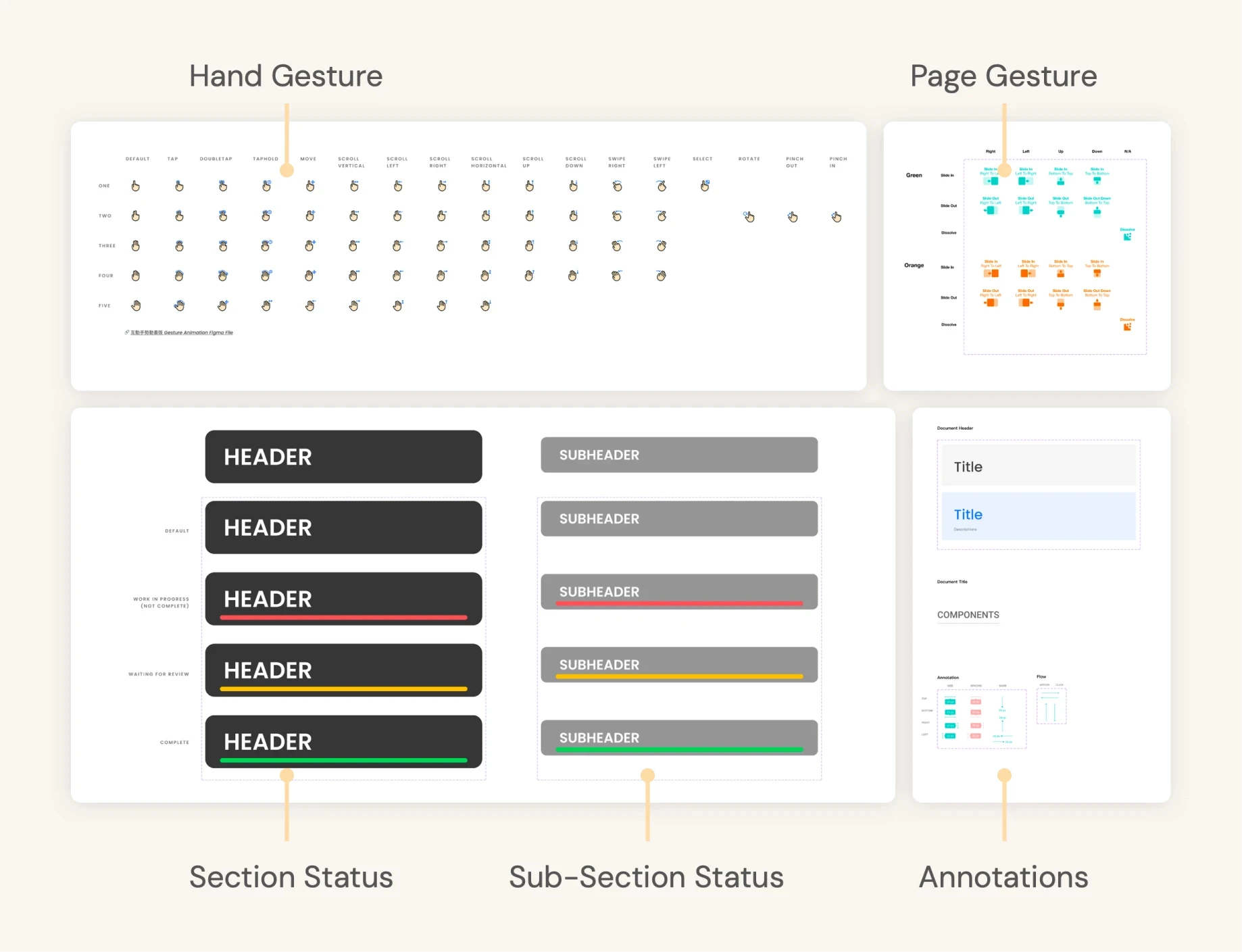
Timeline to Develop the Design System
The team held biweekly syncs with the iOS and Android teams to align on component updates and clarify documentation. These focused check-ins helped balance our time between design system development and other projects, keeping everything in sync.

Creating a Calm, Contextual Experience for Long-Term Investors
🎯Goal
Systemize and establish the company's first Figma Design System component library, centralizing all app components for streamlined team collaboration, on-time delivery, and design consistency.


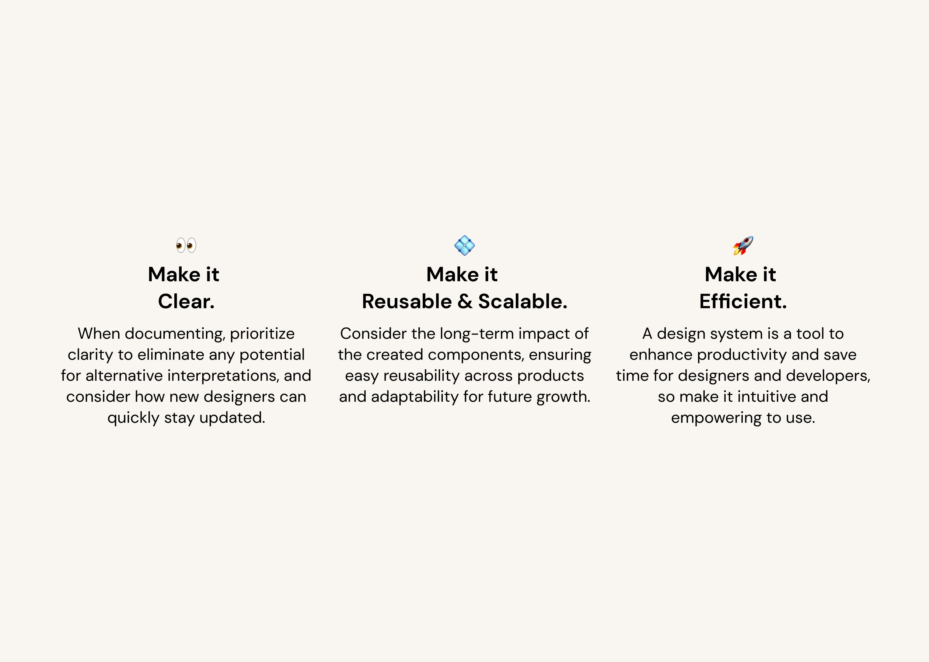
Core Design Principles - Ingrain Value From the Start
In our workshop, 15 colleagues from various departments to collaboratively define our Design System’s framework, ensuring it met the needs of developers, designers, marketing, and support teams. This process led to core principles: ‘Reusable & Scalable,’ ‘Clear,’ and ‘Efficient.’
Streamlining File Organization and Component Creation
Problem
Lack of Standardization in Workflow & Documentation
Before the design system, scattered components and lack of centralized access caused inefficiencies. This was resolved by creating two guides: “How to Write and Organize” and “How to Build a Component.”
Solution 1
✏️ How to Write and Organize
Offers detailed guidelines on structuring files and establishing clear, consistent naming conventions to maintain clarity.

Solution 2
🔨 How to Build a Component
Moving from Sketch, we needed to standardize component design to improve efficiency. For example, inconsistent button designs made edits more difficult.
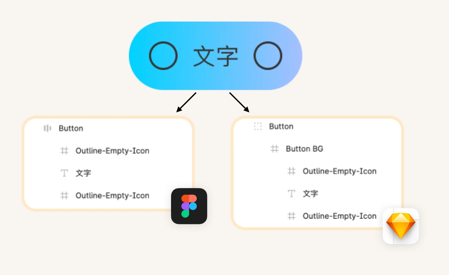
Thus establishing clear, step-by-step guidelines ensure consistent responsive component design with a standardized naming system, enabling smooth handoffs and alignment between design and development.

Setting Guidelines on UX Writing
Problem
Inconsistent Writing Styles Across the App
Many inconsistencies in writing was found across the app, like different date and currency formats.

Guidelines - Writing Formats
Establishing Consistency in UX Writing
The UX writing guidelines set clear standards for team-wide consistency. These include terminology (e.g., ‘WiFi’ vs. ‘WIFI’), date and currency formats (NTD, TWD, $), and integration of bilingual elements (Traditional Chinese and English).
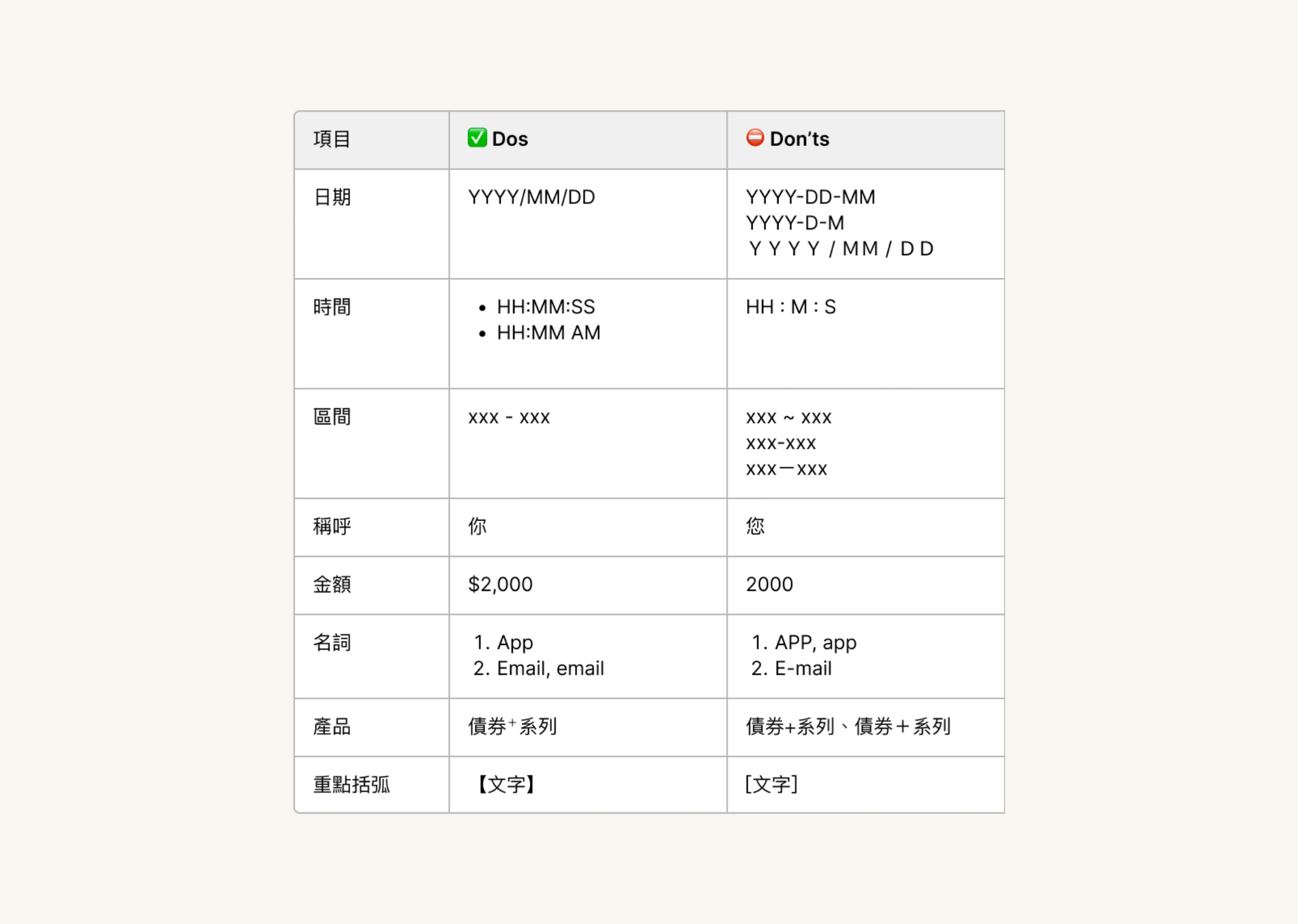
To ensure clarity and consistency, UX writing should follow standard numerical formats that align with global conventions, reducing confusion across regions with varying date formats like YMD, DMY, and MDY.

Problem
Different Scenarios Needed Different Tones
Although the app maintained a consistent tone, different scenarios required adjustments based on the situation’s seriousness.
Guidelines - Tone by Situation
Guidelines for Adapting "Tone by Situation"
“Tone by Situation” is defined to align with different scenarios, ensuring users recognize the seriousness of a situation and respond appropriately, whether through actionable behavior or a calm, welcoming interaction.
For example: A firm and urgent tone was needed when a user was at risk of defaulting on a payment, while a more welcoming and encouraging tone was appropriate during onboarding.
Adapting language tone to different scenarios enhances user understanding and engagement, ensuring interactions feel relevant and appropriately match the seriousness of each situation.

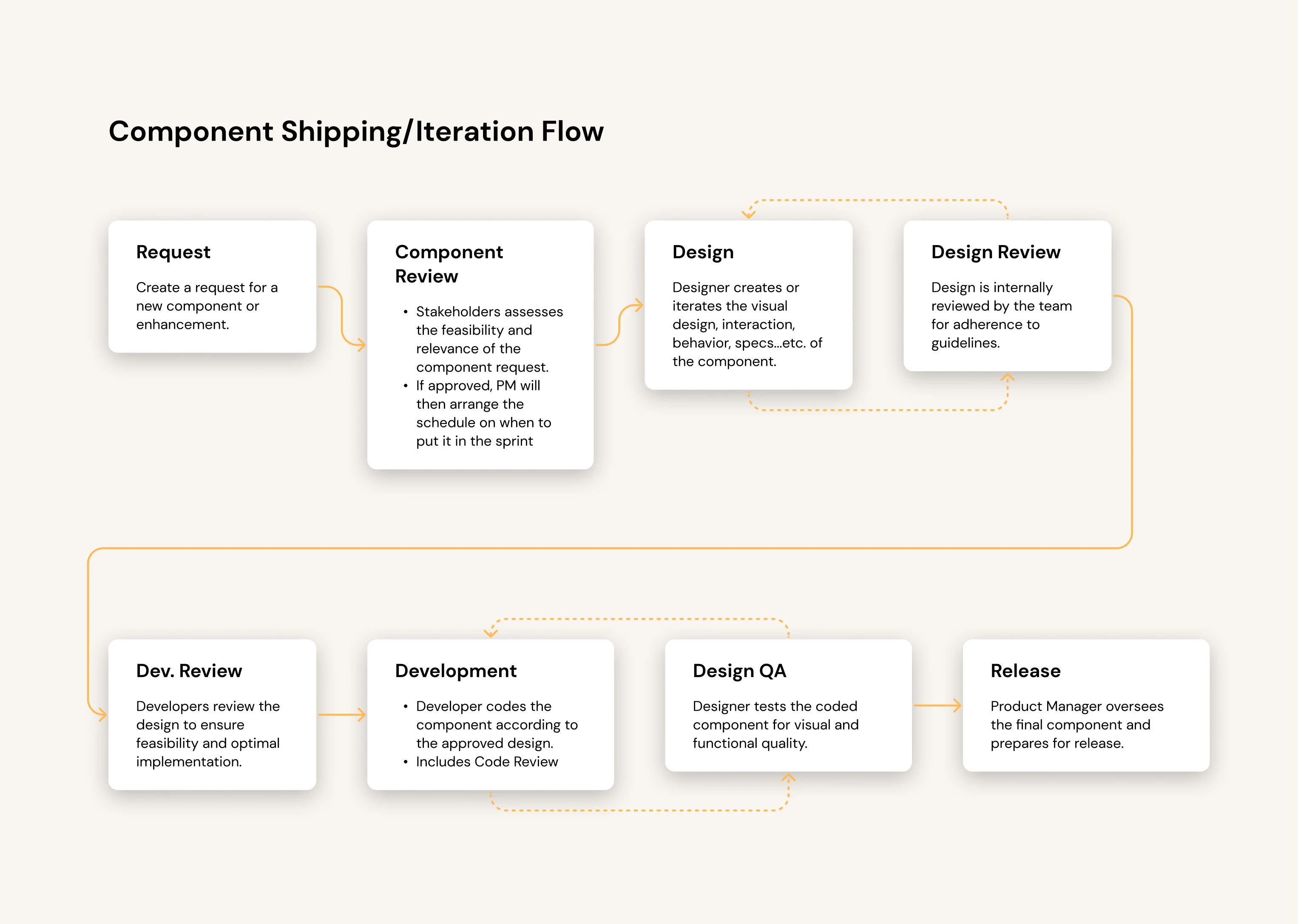
Develop an Iteration Workflow
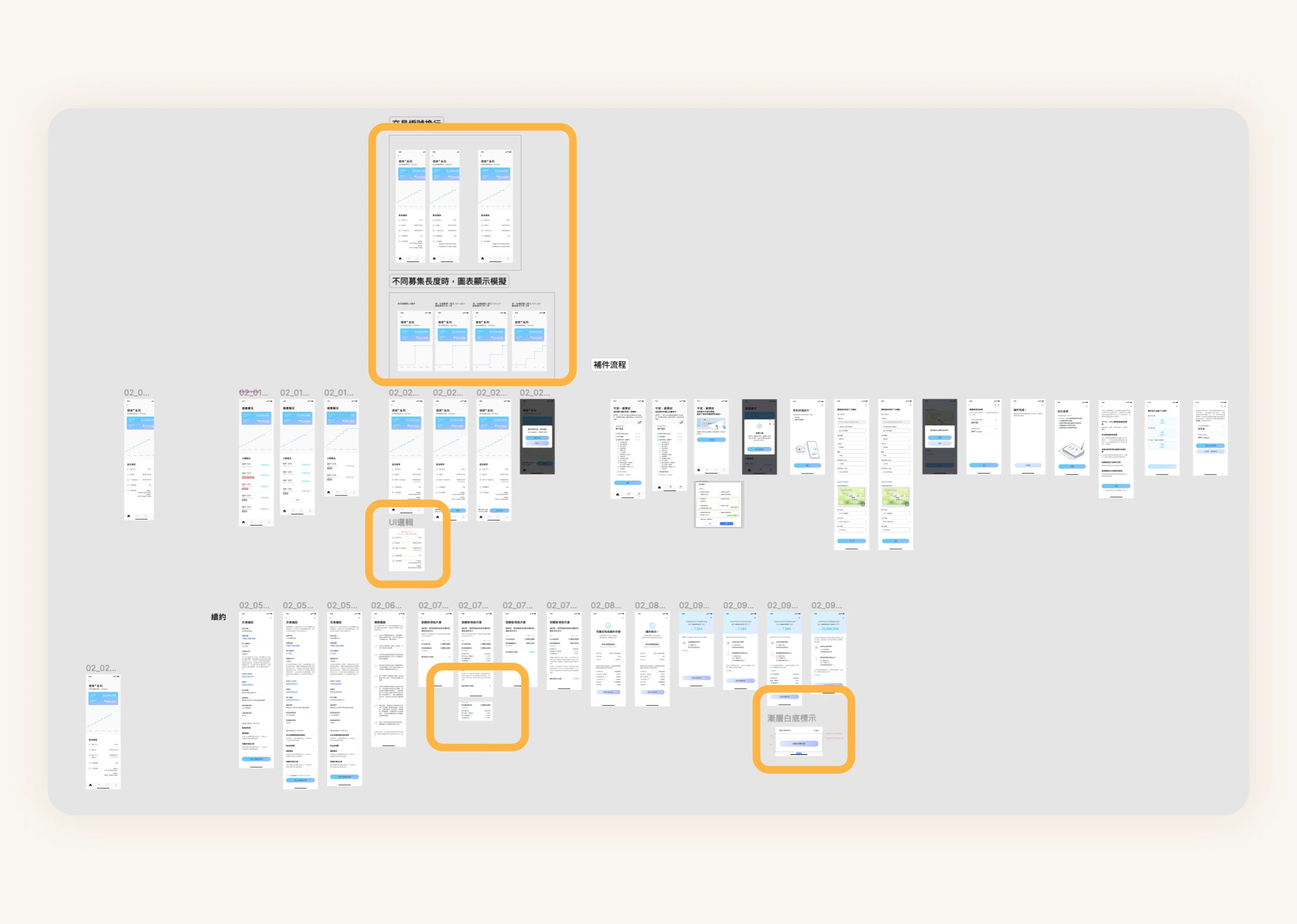
I worked with the Mobile and Brand teams to refine the design system and gather feedback, establishing a clear process for contributions and component updates.
One Small Step For Design, One Giant Leap For The Team
The new design system boosted efficiency by 20% and reduced UI bugs by 25%, tracked over six months before and after implementation. Team impact included:
Developers: Gained more time for development, reducing the likelihood of bugs.
QA Engineers: More efficiently identified inconsistencies between iOS and Android.
Designers: Focused more on problem identification, research, idea generation, and high-fidelity refinements.
There’s Always Room for Improvement!
Looking back, setting up a feedback channel for team members to report issues, suggest improvements, and share experiences with the design system could have enhanced communication and facilitated ongoing refinements:
Modular Library Structure for Enhanced Scalability
To support scalability, I would consider splitting foundational elements and individual components into separate library files to increase modularity.

Feedback Funnel for Improvement
Additionally, a dedicated feedback channel could encourage ongoing dialogue and continuous improvement of the design system, aligning the system’s growth with team needs.

Learnings from Building a Design System from Scratch
It's a Never Ending Process
Building a design system is an ongoing process that evolves with team and user needs, ensuring long-term adaptability to meet new demands.
Never Forget the End User
Focus on the end users. Remembering whom I’m designing for makes decision-making easier, especially during challenges.
Structural Thinking From LEGO
Building a design system is like LEGO: starting small, it streamlines workflows, fosters consistency, and ultimately enhances user experience and delivery speed.
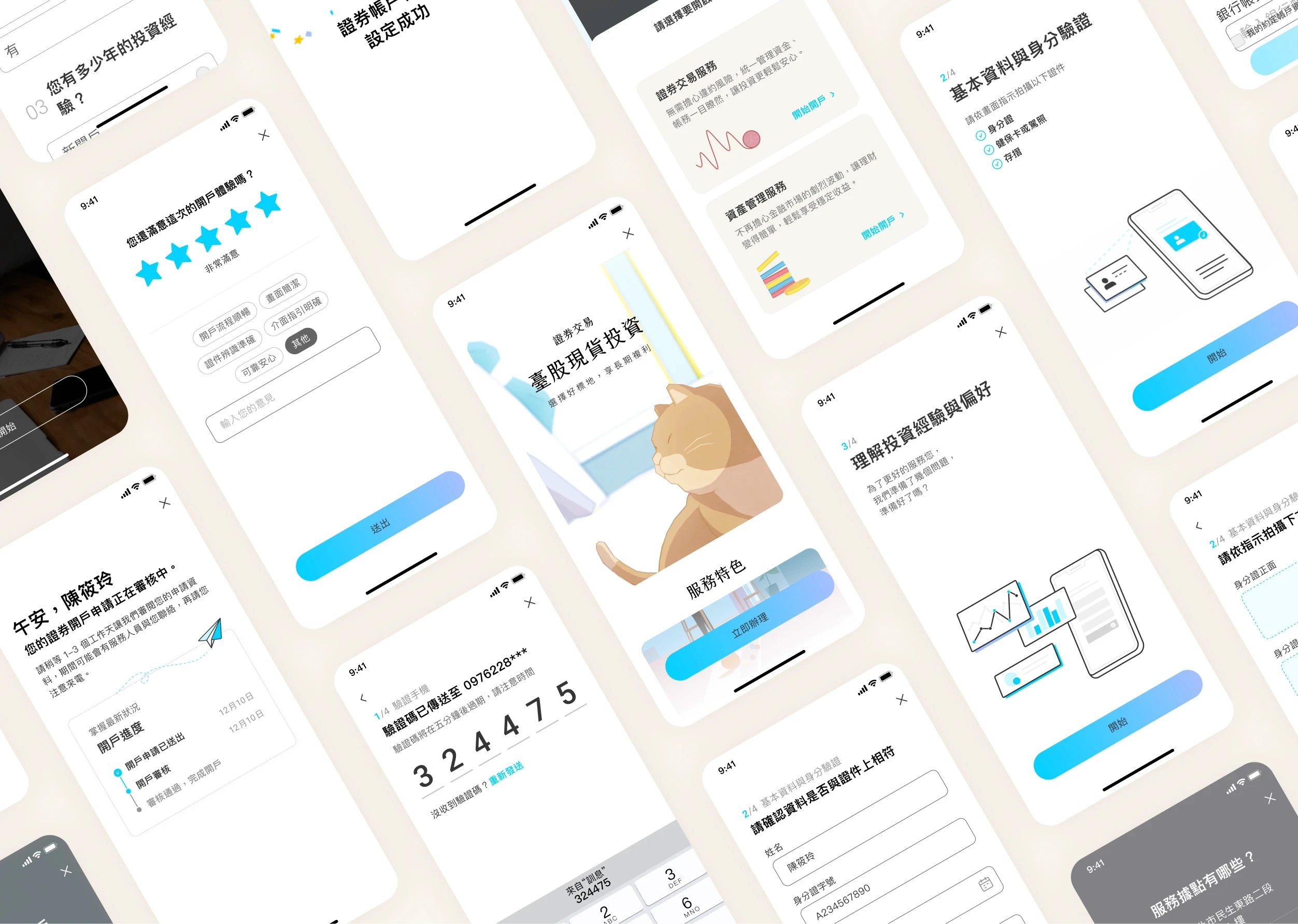
Next Project
Stock Account Opening
Increased AUM by $2.05 million USD in 4 months by designing an account opening portal.
Good Finance Securities is undergoing a digital transformation. With over 200,000 offline account openings and $4.6 billion in AUM, the company faced a decline due to online competition and a market shift during the pandemic. This project marks its first move in 35 years to launch an online account opening portal and attract younger investors.